Signed and dated lower left: Emily Mason '81-'82
Signed and dated lower left: Emily Mason '81-'82
This painting is recorded in the Emily Mason | Alice Trumbull Mason Foundation archives and catalog.
Private collection, Vermont
Private collection, Connecticut
Jody Klotz Fine Art, Abilene, TX
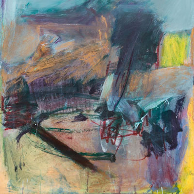
“When I start a picture I like to use the medium as directly as I can . . . [this] puts me in a state of mind which avoids pictorial constraints. I try to use paint for its brilliance, transparency, opacity, liquidity, weight, warmth and coolness. These qualities guide me in a process which will determine the climate of the picture. All the while I work to define spatial relationships, resulting in certain kinds of places. I cannot name them but know intuitively when they appear.”
- Emily Mason
Born and raised in New York City, Emily Mason’s art education began in the studio with her mother Alice Trumbull Mason, a founding member of the American Abstract Artists. A graduate of New York City’s High School of Music and Art, she attended Bennington College and The Cooper Union. In 1956, she was awarded a two-year Fulbright Grant to paint in Venice, Italy. There, she studied at the Accademia di Belle Arti where she first experimented with blotting and transferring paint onto the surface of the canvas. In 1957, at the Ponte de Rialto, Mason married painter Wolf Kahn (1927-2020), with whom she had two daughters.
Since she emerged on the 10th Street gallery scene in 1960 with Area Gallery, Mason has exhibited regularly in New York City. In 1979 she was awarded the Ranger Fund Purchase Prize by the National Academy of Design. For more than 30 years, Mason taught painting at Hunter College. Her work is included in numerous public and private collections.
In 2006, George Braziller published Emily Mason: The Fifth Element, a comprehensive treatment of her work by David Ebony and Robert Berlind. In 2015, University Press of New England released her second monograph, Emily Mason: The Light in Spring, featuring prints and paintings since 2005, edited by Ani Boyajian with text by David Ebony and Christina Weyl.
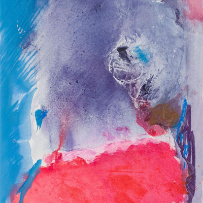
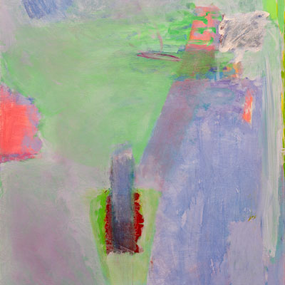
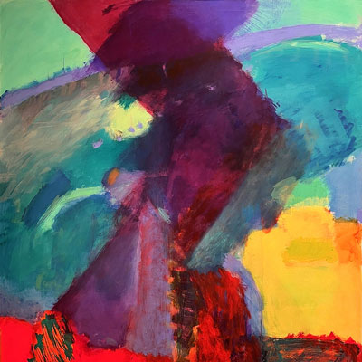
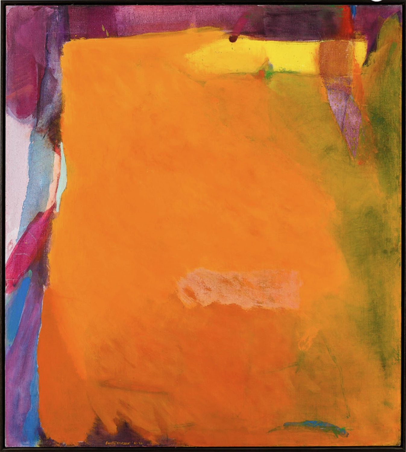
Emily Mason is an instinctive colorist and as such, is drawn to the same vocabulary that other colorists have used, extemporizing as she goes along. Her abstractions are rich with areas of layered, saturated color contrasted with delicate, translucent washes and glazes that resemble watercolor, with recessions and advances, push and pull, with monochromatic planes interrupted by fissures and crevasses of other colors, flurried with small rains of brushstrokes, scumbled, rubbed, scraped. The boundaries of her protean shapes can seep into each other, rippled where one image slips imperceptibly into others with usually no hard and fast demarcation, no defined edges or clear lines but the transition is accomplished nonetheless. The fluidity, however, is gently but firmly structured, locked into place, into Mason's version of dynamic equilibrium. Often, only two or three colors dominate a canvas but a whole rainbow has been requisitioned in the making of it, with other hues underneath, floating on top, woven into the surface, into the texture, tucked into corners. Her corners are often surprising and full of incidents; here she can slip a few more shades in, overlaying them, brushing them on top of each other.
Mason is a woman of infinite variety. Her brushstrokes can melt into each other, shimmer, go flat, the color deepens, becomes sonorous yet in other places, it is whispery, translucent. Mason says she never likes to use white paint, preferring to let the white of the primed canvas show through for glow. The exterior light is also important and affects her painting; there is summer light and summer painting and winter light and winter painting, like Northern and Southern schools reconciled in one artist, The surface texture can be velvety or sleek, and the paint can transform itself at times into metal, glinting gold or copper. A yellow line, for instance, in one painting appears bright gold, an illusion created by its interaction with the colors in its vicinity. Mason does use gold but infrequently, content with the alchemy of paint itself.
Her sense of color is assured, in exuberant, innovative, often denatured combinations. Her reds are remarkable—a whole range from warm to cool, light to dark. One painting is flooded with red, balanced by pinks and magentas, cooled by a touch of unnatural green while another thrust of red is tipped by yellow, like the point of an arrow, surrounded by swirling streaks of purple. Another is mainly yellows and oranges and blends of yellow-orange, cut through by a flash of bright turquoise paired by a darker scrap of turquoise.
Her primaries are more Miami than Neo-Plastic: purple instead of blue, orange instead of red, gold instead of yellow. Her complementaries are reds that shift into rosy pinks, magentas and greens that veer toward lime and acquamarine. Purple and yellows are also frequent combinations but in a wide range of tones and complex relationships. Mason learned early that context is paramount and that colors influence each other in so many ways, such as hue, tonality, temperature, mood.
As for content, they may or may not be abstractions of landscapes, of imagined aerial views, oceanic depths or tropical gardens. Mason says they have a relationship to place but are not meant to be landscape. However, if landscape creeps in afterwards, she can accept that; she believes in nature. Be that as it may and whatever else they might be, Mason's paintings are first and foremost an art of sensation. Based on vision, they are a joyous and triumphant affirmation of color and of painting itself, the once and future medium.
Mason passed away on 10 December 2019, the birthdate of her namesake, Emily Dickinson.

Monday - Friday
9:00 am - 5:30 pm
Evenings & weekends
by appointment
1060 North 2nd Street
Abilene, TX 79601
325.670.9880
Monday - Friday: 9:00 am - 5:30 pm
Evenings & Weekends
by appointment

.png)